The visual identity module
A look that says
you
belong.
Not one that says cheap import.
A Western buyer judges you in about three seconds, before he reads a word. The logo, the colors, the type. If it looks built for another market, he feels it, and he leaves.
0s
A Western buyer judges your look before he reads a single word.
Logo, color, type. Built to pass that glance.
Your site is the ticket in
To a Western buyer, your website is the proof that you are real.
Before the call, before the samples, the site decides whether there is a call at all.
A supplier without an independent website, we default to assuming weak digital capability and higher cooperation risk.
Most Chinese sites fail his test the same way. They are an online catalog, photos and specs and a price, and nothing else. No promise, no customer story, no proof. He cannot tell a serious partner from a reseller, so he closes the tab.
What reads as cheap
Four ways a China-built look loses a Western buyer.
Each one gets a before and an after you can judge in a second. The example colors and shapes below teach the point, they are not the colors of this page.
Red and gold
At home the pairing signals quality and luck. In the West it reads as a discount sticker, or a takeout menu. The buyer does not think premium, he thinks promotion.
Lookalike logos
The fast-food resemblance is common, and the knockoff is worse. One Chinese brand copied a French luxury serif so closely that buyers assumed the whole thing was counterfeit. Borrow too hard and you look fake, not high-end.
Color on the screen
A palette chosen for a glossy China brochure can turn washed out, or harsh, on a US monitor. Western categories carry their own codes. Blue says reliable, green says clean energy, and the wrong choice tells a buyer you are in the wrong business.
How color encodes category
industrial
renewables
reads: warning
Type that fights the reader
Decorative or calligraphy-style English fonts feel dated and hard to scan, and Chinese layout logic does not carry over. English has its own habits.
Lines set too tight, too wide, hard to scan and tiring on the eye across a long measure of running copy.
Set at the right measure, the line breaks where the eye expects and the copy stays easy to read.
Why it moves money
Good design is silent proof that you understand the market.
A buyer cannot inspect your factory from his desk, so he reads your design as a stand-in for the whole company. Clean and confident says serious partner. Cluttered and off says risk.
Named proof
EXLANTIX, built to land with Western buyers.
For EXLANTIX, Chery's premium EV line, we built a full visual identity for a global launch, one that broke from traditional Chinese design on purpose so it would land with Western buyers. Emblem, type, color, the auto-show stand, all of it built to one system.

Industry example, not our numbers
A solar company dropped a red-and-gold mark that drew fast-food jokes, led instead with one line, "Clean Energy, Every Home," and cleaned up the layout. Orders roughly doubled inside six months and the cost to win a customer fell by about a third. The look moves the money.
What we build
Four parts, one system.
Logo
A mark that works small and large, on a website, a booth, a card, a product label, and reads right for your category instead of just looking nice.
Color
A palette built for Western eyes and Western screens, in the colors that signal the right industry and the right tier of quality.
Aa Bb Cc
The quick brown fox jumps over.
Type
Type that reads clean in English and follows English rules for spacing, line length, and numbers.
System
The simple rules that keep it all consistent, so your website, your deck, and your booth look like one company instead of three.
How an identity build runs
From your positioning to a system your team can hold.
- Anchor
Start from strategy
The identity grows out of your positioning, so the look matches the story and nothing is just decoration.
- Design
Design the core
Logo, color, type, as real options that each carry an idea, not endless variations on one theme.
- Systemize
Turn it into rules
A system your team and partners can follow, so the brand holds together long after we hand it over.
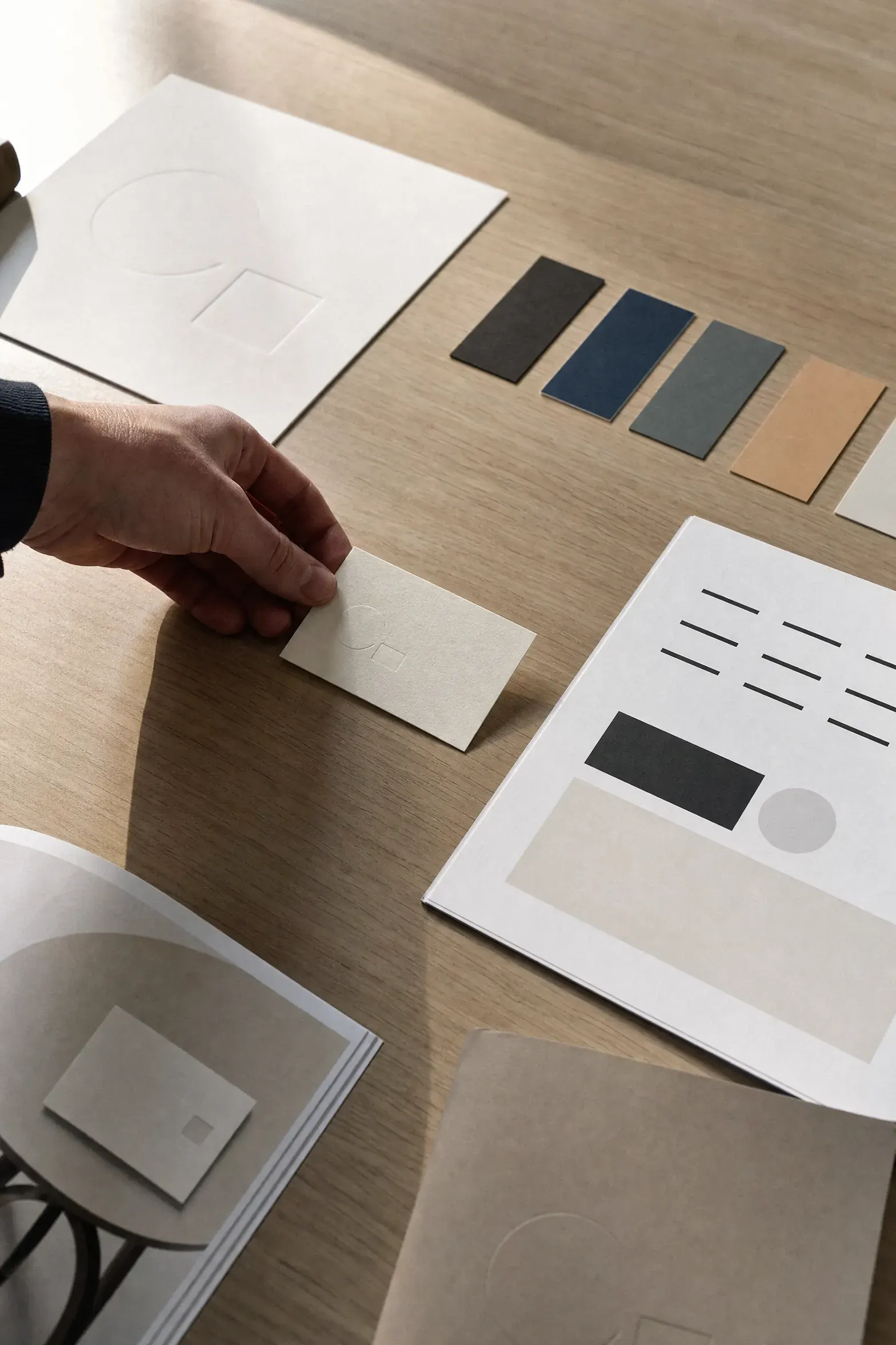
The brand book, kept short
No 80-page deck nobody opens. You get a short brand book with the rules that matter: how to use the logo, which colors, which type, which spacing. Enough for your team and your partners to apply the brand and get it right every time.
FAQ
Questions, answered plainly.
What is "visual identity"? Is it just a logo?
The logo is part of it, but not all of it. Visual identity is everything a buyer sees: your logo, your colors, your fonts, and the rules that keep them consistent. It is how your company looks across your website, your booth, your packaging, and your deck. The goal is simple. A buyer should see your stuff and feel "this is a serious company," in about three seconds.
Three seconds? Is that real?
Yes. A Western buyer judges your website or your booth almost instantly, before reading a word. If it looks built for another market, he feels it and clicks away. We have seen a strong product get almost no sales online because the site looked cheap. The product was fine. The look killed it.
Our logo is red and gold. It looks lucky and premium in China. What is wrong with it?
In China red and gold says quality and luck. In the West that exact pairing says discount sticker or takeout menu. The buyer does not think premium. He thinks promotion, or cheap. Color means different things in different places. The colors that win at home can quietly signal "low end" abroad.
So you will just change our colors and charge us for it?
No. We start from your strategy and your category, then choose colors that signal the right industry and the right quality level to a Western eye. Blue reads as reliable. Green reads as clean energy. The wrong color tells a buyer you are in the wrong business. It is a decision based on your market, not on taste.
Can't my designer in China just make this?
He can make something that looks good to a Chinese eye. The problem is he is solving for the wrong audience. He does not feel why a logo looks like a fast-food sign to an American, or why a font looks dated to a German. Same issue as naming. You need the eye of the market you are selling into, not the one you are sitting in.
What do I actually receive?
A logo that works small and large. A color palette built for Western screens. Fonts that read clean in English. And a short brand book, the rules for using all of it. Not an 80-page manual nobody opens. A short, usable guide so your team and your partners apply the brand the same way every time.
How much does it cost?
It is a project fee. The number depends on how many places you need the brand applied, just a logo and colors, or a full system across website, packaging, and booth. We scope it and give you the number before any work starts.
How long does it take?
A full identity usually takes six to eight weeks. A smaller piece is faster. We give you the timeline up front based on what you need.
Will I get to choose between options, or do you just hand me one?
You see real options, each with a clear idea behind it. Not fifty tiny variations of the same thing to pad the deck. Each direction carries a different thought, so you are choosing between strategies, not just shades of blue.
We already have a logo. Do we have to throw it away?
Not always. Sometimes a logo just needs adjusting for Western use, not replacing. Sometimes it is sending the wrong signal and should go. We tell you honestly which one it is. We do not rebuild things that already work just to bill you.
Does this really make money, or does it just look nicer?
It moves money. Here is an industry example, not our own numbers: a solar company dropped a red-and-gold logo that drew fast-food jokes, led with one clear line, and cleaned up its layout. Orders roughly doubled in six months and the cost to win a customer fell by about a third. The look is not decoration. It is what a buyer trusts before he trusts anything else.
Why does the font matter? Letters are letters.
Not to a Western reader. Decorative or calligraphy-style English fonts look dated and are hard to read. English also has its own rules your designer may not know: line length, spacing, prices written as $1,299 not RMB1299.00, units in inches and pounds. Get those wrong and the page feels off, even when the buyer cannot say why. Off feels foreign. Foreign feels risky.
Our website is just our product catalog. Is that a problem?
Yes, a big one. A catalog of photos, specs, and prices with nothing else tells a buyer nothing about whether you are safe to work with. One procurement manager said plainly that a supplier without a proper website gets treated as high risk. The site is your ticket in. No site, or a weak site, often means no call at all.
Who does the design work?
A team that has built identities for Western markets for over 20 years, including premium launches that broke from Chinese design on purpose so they would land abroad. The work is judgment, not just drawing. You are paying for people who know what a Western buyer's eye trusts.
What do you need from us to start?
Your strategy first, if you have it, since the look should match the message. Your current logo and materials. Where you plan to use the brand. And honesty about what feels off in your current look. The clearer you are about the goal, the sharper the result.
One clean system
Look like the company you already are.
A strong identity makes everything else work harder. Your website, your ads, your sales kit all pull from one clean system.
Judged in three seconds. Built to pass.
Reviewed May 2026